What is responsive page design?
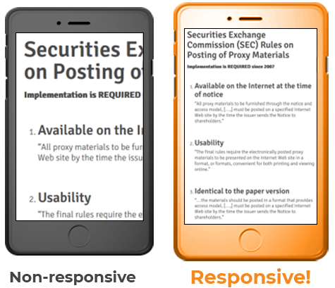
"Responsive" means that the text on a web page reconfigures itself on different screen sizes. So instead of content being shrunk to an unreadable size on a smaller device and requiring the user to pinch/zoom to read the text, the text on a responsive page will be reformatted to fit the device's screen and remain readable. Users will still scroll vertically to read the content, but not horizontally, making the pages usable on smaller devices.
See the example on the right that shows how a responsive version of a document can reformat the text so that the reader doesn't have to scroll both vertically and horizontally.

Why should content be responsive?
Because of the massive install base and increased use of smartphones and tablets, companies are rapidly upgrading their websites to be responsive. The current ownership numbers show that 97% of Americans have a smartphone, 77% have a desktop or laptop, and 53% have a tablet.1
What challenges do financial documents have in becoming responsive?
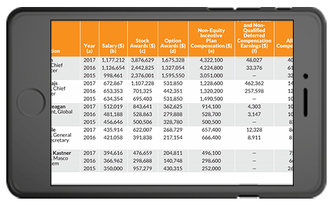
The largest hurdle is how to properly display large tables, which are mainstays in Annual Reports, 10-Ks, and Proxy Statements. The data in tables is far too wide to be readable on smartphones, and if scrolling is added, it becomes cumbersome to read the table itself.
For this type of content to work in a responsive way, it needs a complete redesign. Only a couple of the S&P 500 have attempted this type of conversion, and it remains cost-prohibitive for most companies at this time.

Recommended approach:
partial responsive
To manage cost and timing, we recommend an approach where key sections of your document (summaries, introduction letters, etc.) are converted to responsive while the rest of the document is left in the traditional format. This approach is cost-effective and still provides your digital investor with a good experience on their devices.
Please reach out to us today to see our sample client demos.

